Flux Ignores Everything: Part I
Something has been bothering me for a while now, and I feel like no one is directly talking about it:
Flux ignores significant parts of a prompt.
On some level, I think this is just recieved wisdom1, and people don’t talk about it because there is no good understanding about why some parts of prompts are attended to, and why some parts are not. But, I also wonder if there has been any efforts to quantify this issue. So, this will be an occasional series where I take an image created with Flux, both mine and others, and break down exactly what made it into the image, versus what was in the prompt.
The first image is one from r/FluxAI, a small tortoise2, with a castle on its back.
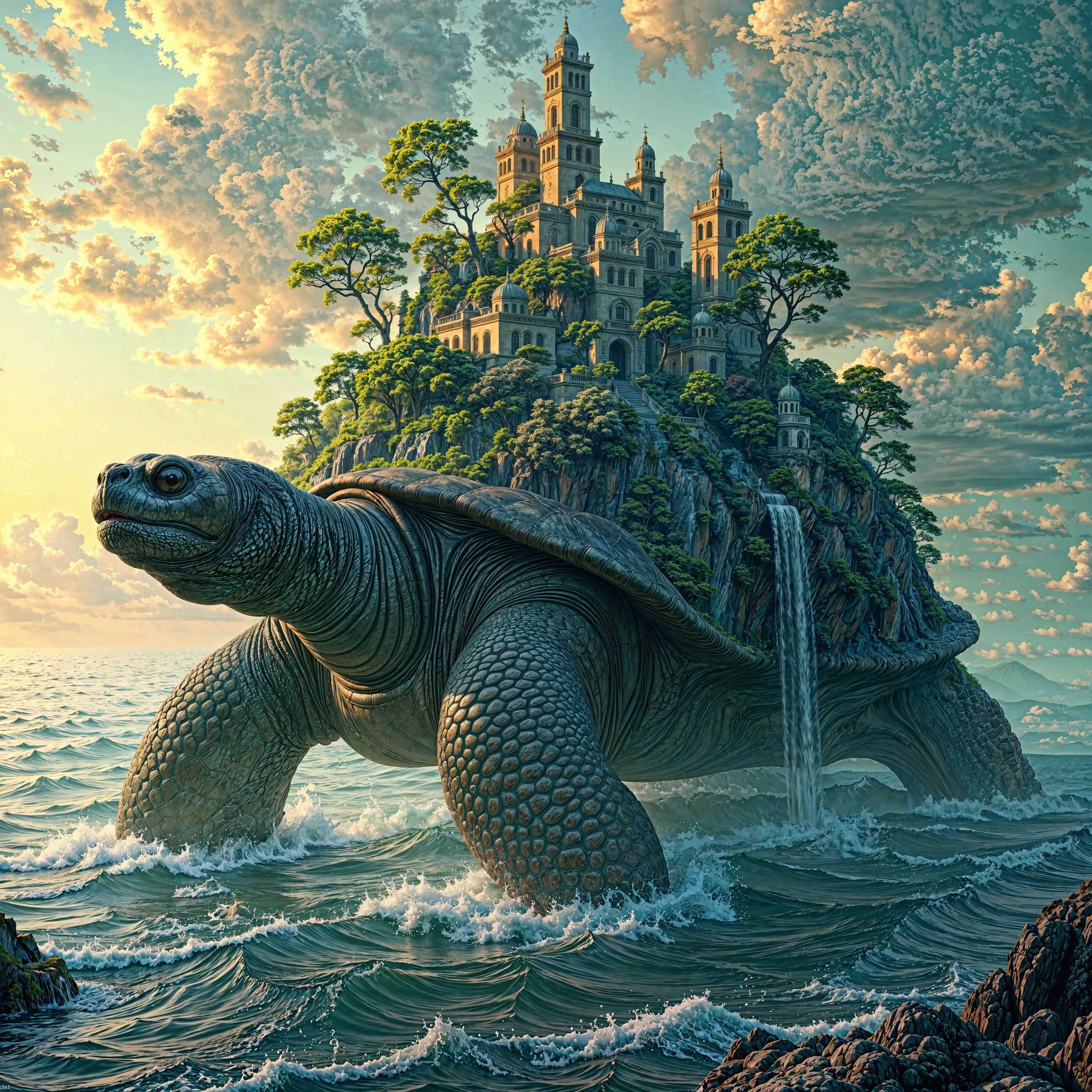
And then, the caption:
A hyper-realistic scene of a colossal ancient tortoise moving slowly across an endless ocean, with waves gently lapping against its sides. Its massive shell is transformed into a lush, dense forest, teeming with towering trees, cascading waterfalls, and a hidden misty village tucked among the foliage. A city of intricately designed structures is built seamlessly into the natural landscape, with rope bridges connecting various sections high up in the trees. The sky above is painted with the warm hues of a setting sun, blending into a starry twilight, casting soft, ambient lighting over the scene. The atmosphere is serene and magical, evoking wonder and timelessness, highlighting the harmony between civilization and nature. The wide perspective emphasizes the grand scale of the tortoise and the finely detailed city, creating an enchanting and mystical ambiance.
I asked Llama-3.2 to generate a list of concepts in the prompt, and it came up with 14. I then went through and scored if the concept was either not present (“-“), present, but with serious issues (“=”), or clearly present (“+”). Of those 14 concepts, Flux got exactly two of them right (14%), and a further 28% were there in a compromised fashion. That means that fully 58% of the mentioned features or concepts did not get included in the image. 3
I’ve been reading a lot of prompts on civitai.com, and what strikes me is how overloaded they are. It’s not uncommon to see 4-6 terms that all boil down to “highly detailed” (“4k,” “RAW,” “High-Res,” etc.) I want to explore what happens when you taking out terms one by one, and see what remains. (I mostly use DrawThings, and I’m not sure it is as amenable to automation as other interfaces, like ComfyUI, are.)
The Concept List
-
- colossal ancient tortoise
- = endless ocean
-
- lush dense forest
- = towering trees
- = cascading waterfalls
-
- hidden misty village
- = intricately designed structures
-
- rope bridges
-
- setting sun
-
- starry twilight
-
- ambient lighting
-
- serene atmosphere
-
- magical ambiance
-
- harmony between civilization and nature
Key: + - Present, = - Present, but with issues, - - Not present
-
Coming back to this several months (2025-05-18) later, it’s not that no one talks about it. People do, and they call it “prompt adherence.” But, I think it is the case that it’s hard to explain why some things are in a resulting image and why some things are not. Moreso, my suspicion is that there is a complex interaction between prompt terms; removing the section on shoes will affect what kind of shirt a person gets. ↩
-
The prompt specifies a “colossal ancient tortoise,” but this creation is a mere mote in the eye of the Great A’Tuin ↩
-
I will cut Flux some slack here. “Magical Ambiance” and “serene atmosphere” are not easy to represent. But, the same cannot be said for “rope bridges” or even “starry twilight.” ↩